Welkin User Guide
Design Concepts
Welkin is an archaic english term to define the celestial sphere, the apparent surface of the imaginary sphere on which celestial bodies appear to be projected (kudos to Jessica Klein for suggesting it to us).
The reference to the sky and celestial bodies is very meaningful in this context: Welkin is not meant to be a tool to discover a single RDF statement out of a thousands, but it's meant as a "telescope" for your RDF data, a tool that lets you understand its global shape and cluster characteristics rather than the individual item.
So, if you are thinking about using Welkin as a flashy and sexy frontend tool for your dataset, think again: end users don't care about obtaining a mental picture of an entire dataset, but care more about the extreme locality. They don't care about your galaxy, they want to find the planet that has enough air for them to survive! If that's what you are looking for, the Longwell facetted and textual browser is probably what you want.
Welkin is not designed as a tool for end users, it's thought for an audience of data and metadata analysts (not necessarily RDF-savvy!) that need to:
- get a mental model of a dataset they are not familiar with (including the ontologies used to describe it)
- have a sense of the density of connectivity of a particular dataset or dataset fragment
- identify potential mappings between resources and ontologies (we plan to expand this functionality a lot more in the future)
- have a way to rapidly test and visualize the RDF you are working on to understand if there are mistakes in the model as well as spelling mistakes in the namespaces and URIs (believe us: this happens more than you would expect!)
- discover the parts of your dataset that have special graph-theoretical properties and therefore might 'stand out' as having some latent meaning that might get otherwise unnoticed with localized browsing models
User Interface Layout
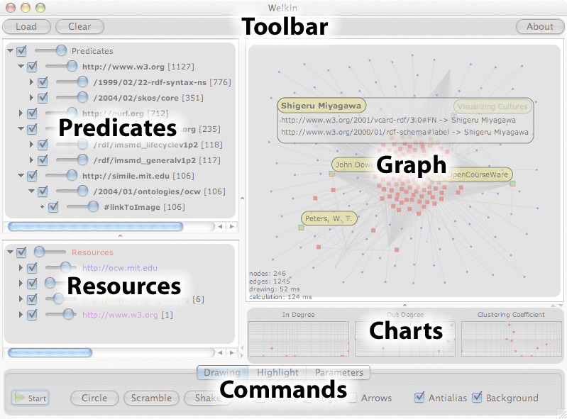
Let's look at a screenshot of the Welkin User Interface, this time outlining the various panes:

This screenshot was taken on MacOSX. Since java has pluggable look&feel, the look of Welkin on your platform might be different, but don't worry, the panes and buttons will be in the same position and the would have the same exact functionality (or, if not, it's a bug and please, report it to us).
Toolbar
The toolbar contains three buttons:
- Load - Loads RDF into the memory model (besides RDF, Welkin can load RDFS, OWL and TURTLE which is a subset of N3).
- Clear - Clears the memory model and resets to the starting point
- About - Shows the About box with credits and copyright info
When a model is loaded, you can keep adding new statements to the loaded model by loading other ones. This is very useful to merge different models and see if/how they connect.
Graph
The graph pane is the main Welkin pane and where the model visualization takes place. The Welkin Graph canvas is highly interactive. We believe that fast and immediate interactivity is the key for a better understanding of a very complex model, rather than panning and zooming on statically drawn graphs.
When the RDF memory model is empty, the graph pane doesn't show anything. By using the Load button in the toolbar above, you can load statements from files on your disk (we plan to introduce the ability to connect to Sparql web services once the protocol gets finalized).
Once RDF statements are loaded in memory, Welkin represents them as dots and lines, placing them at, initially, at random locations.
To reduce clutter, Welkin does not display literals as nodes, but rather presents them in a box as soon as you click the note that you are interested in. Literals can never be subjects of RDF statements, therefore they always represent leaves of the graph, which we believe do not add any useful topological information to the visualization and just add clutter. This also means that if your RDF model does not contains statements with predicates that link two resources, you will see disconnected nodes, even if there are literals hanging off of them.
Dots can have two different shapes, depending on whether or not they are used as subjects in any of the statements currently loaded in memory: a small dot  represents a resource that is used only as an object, a larger dot
  represents a resource that is used at least once as a subject. The reason behind this visualization is, again, to reduce clutter: object nodes are normally more numerous and, in the sense, that they are just referenced by the loaded model, as only subject nodes are actually described in the mode. Small dots might turn into larger dots if new statements are loaded that use that node as a subject.
In case there are two different predicates between the same resources, Welkin displays only one line. We plan to research ways to visualize multiple predicates in a way that is efficient in both performance and visualization effectiveness. Also note how the predicates are not shown on the graph display. We also plan to work on efficient ways to allow mouseover-like effects to visualize the predicate values in the future.
RDF models are directed graphs, but for performance reason Welkin defaults with the direction arrows of the predicates turned off. To turn it on, check the Arrows check-box in the Drawing tab of the Commands bar at the bottom of the Welkin screen. (see more about the drawing commands and options below)
The graph panel reacts to mouse clicks. There are three events that it currently recognizes, each with a different effect:
- click - selects the node that is closer to the click. While the mouse button is still pressed, the literal window will keep showing. When the graph is active, the click holds the node in place and avoids it from moving as long as the mouse button is pressed. By keeping it pressed, you can also drag the node around.
- double-click - makes the node sticky and highlighted. This means that its
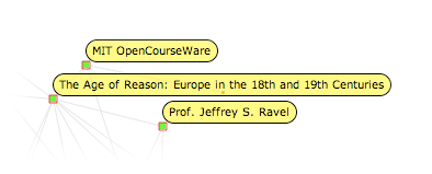
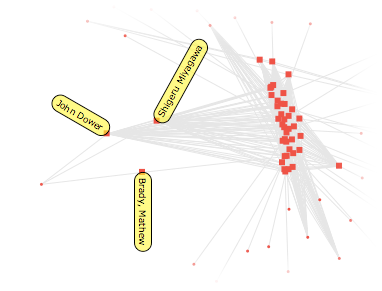
rdf:labelor resource URI gets shown even when the mouse button is not pressed and that the node is no longer free to move along the graph canvas but it's hold in place by the click. Another double-click releases the node and returns it to the original floating state. - right-click (or ctrl+click on MacOSX with a single button mouse) - Turns fish-eye zoom on, where the space geometry is distorted around the mouse pointer, so that highly clustered nodes can be spaced apart and labels get shown pointing radially from the center (as to increase visibility). This is useful to have an overview of the contents of a particular node cluster in one shot. Releasing the mouse button make the space geometry return gradually to its initial state.


Commands
The commands are divided in three tabs:
- Drawing - contains the main commands that drive the activity and the drawing properties of the graph pane. Here is a list of the commands and their effect:
- Start/Stop - turns on/off the activity of the graph pane.
- Circle - resets the position of all the nodes in a circle centered inside the graph pane.
- Scramble - resets the position of all the nodes randomly around the graph pane.
- Shake - add a random shift from the current position. This is useful to "give the graph a kick" because there are cases where the energy minimization algorithm encounters a local minimum and not a global one. By shaking the nodes, you might force the graph to reach the global minimum, thus a more meaningful representation of the clusters.
- Nodes - turns on/off the drawing of nodes.
- Edges - turns on/off the drawing of edges. This is very useful to speed up the calculations since normally a lot of time is spent in drawing the edges. For large graphs it's useful to start the graph without edges and hen turn them on once the graph has reached a more stable state.
- Antialias - turns antialiasing on/off. In some platforms, antialiasing can be very expensive, just like edges above you can achieve a faster drawing performance by disabling it during graph processing and re-enable it when the graph reaches a more stable state.
- Background - turns background drawing for the graph panel on/off. On some platforms, disabling this gains a little time too.
- Highlight - drives the search and highlight of nodes that have literals or URIs that match particular substrings. The nodes that match get their labels turned on.
- Parameters - fine tune parameters for the graph activity algorithm. Changing these parameters changes the shape of the graph but might also trigger unstable states that won't let the graph condense but rather explode (and you won't see anything in the graph pane because the nodes will be scattered all over), so change with care, or, in case you mess up, click the clear button in the top toolbar to reset the values to their default states.
The time taken to calculate the graph grows with the square of the number of nodes, this means that doubling the node number reduces the refreshing rate by 4 times, not 2! We plan to work hard to fix this severe limitation (and we know how) but for now be aware of this problem and don't go crazy with loading RDF models that contain more than a few thousand nodes resources (don't worry about literals, they don't slow down).
By default, Welkin introduces a 50ms delay between frames. While counterintuitive, experience has shown that reducing this time makes the overall drawing efficiency smaller. Your mileage may vary, so try to lower it and see what happens, but don't be surprised if the system doesn't speed up.
Predicates
Another important design decision for Welkin was to be completely agnostic and neutral about the ontologies used by the RDF model. The only exception is rdf:label which literal, if present, is used as a representation of a resource (or predicate) instead of its URIs.
URIs are opaque identifiers, and, in theory, should not bear any structural information inside of them. In practice, however, they do. We decided to try to parse the URIs that start with protocols identifiers that we understand and create a tree out of them.
The result of this heuristical facetted projection of URIs is contained in this panel. Each predicate contained in the loaded RDF model is shown, grouped by their URIs common prefixes and tokens and two widgets are associated with each of them:
- a checkbox - turns on/off the visualization of the links (and the relative nodes!) associated with this predicate. This is useful to restrict the model to only those predicates that belong to a particular ontology or namespace.
- a slider - identifies the strength of this link relative the other others. By moving the slider on the left side, the strength of the link is reduced, resulting in a reduced clustering effect of this property. Turning it all the way to the left has the same effect of disabling it with the checkbox.
The number in between the square brackets represents the amount of times the predicate (or group of them) is used in the current loaded RDF model.
Resources
Sometimes, instead of focusing on the relationships between resource, you want to focus on the resources themselves. This is the panel that allows that. Again, two widgets perform actions on the relative URI:
- a checkbox - turns on/off the visualization of the nodes (and the properties that were connected to it) associated to this resource. This is useful to restrict the model to only those resources that belong to a particular ontology or namespace.
- a slider - changes the color of the nodes associated to this resource. This is useful to color-code different resources (or groups) and isolate provenance or ontologies based on the information contained in the URI
We found this compact representation of the URI schemes used by the loaded model (both for predicates and for resources) very valuable in uncovering mistakes and/or misspelling of the URI.
Charts
One of the things that drew us to write something like Welkin was the intuition that a lot of information about the graph was passing unnoticed because we were normally browsing an RDF model by looking at the single nodes individually or by projecting them onto a particular dimension (for example, whether or not they contained a link to a particular literal).
We believed that by looking at the distribution of particular properties of the nodes in the graph, we could spot particular sections of our model that could result to be interesting for a particular reason.
There are three graph-theoretical properties of a node that Welkin understands:
- In Degree - the number of edges that point to the node.
- Out Degree - the number of edges that start from the node.
- Clustering Coefficient - the proportion of edges between the nodes within its neighbourhood divided by the number of nodes that could possibly exist between them. In short, how many of the node's "friends" (those connected to it) are friends with one another.
The charts have a logarithmic scale on both sides, since most graph distributions encountered in real life tend to have a pretty long tail (meaning that a lot of nodes have low degrees and a very small number of them has a high degree).
The charts visualize the distribution of the node properties of the graph that is currently visible, not of the one that is currently loaded in memory. This allows more interactive exploration of the graph.
The chart is also reactive: by dragging the right and left bars, you can select a 'range' of nodes that should be visible, while the rest of the nodes get hidden. This is very useful to explore only parts of the graph that exhibit particular distribution properties.
As the following screenshot visualizes, the dots in the grayed-out area represent the nodes that are hidden from the chart based on their in-degree distribution.
